

LAYOUT
Head in the Clouds
Mock book cover jacket and sleeve.

Book Sleeve Layout
Book Mockup

Free My Thinker
Book Cover Draft
-
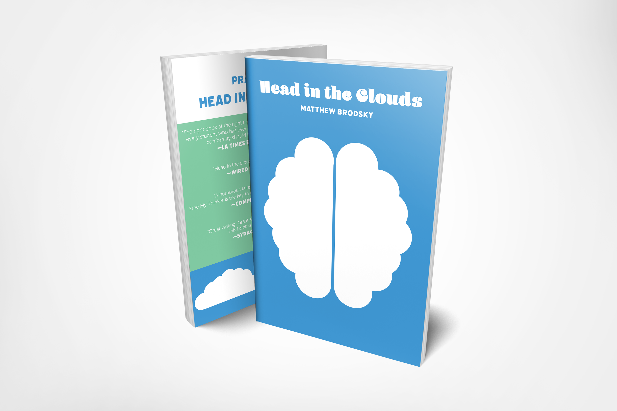
For my book sleeve biopic project, the aspect of my life that I decided to focus on is the idea that I think both deeply and freely. With this in mind, and after talking to my professor, I concluded that thinking freely in the ultimate sense would be to have a perspective of life from the sky and on earth. Therefore, my design is a brain made out of clouds, and the title of my book is “Head in the Clouds.” The cloudy brain sits .625 inches away from the sides of the book.
-
To represent the earth, I utilized color to reinforce the idea that my head is in the clouds, but my feet are still on the ground. The primary illustration, the cloudy brain, is white and most of the type on the book jacket. The color white represents clouds as well as my free-flowing train of thought. Sitting the background colors on my book jacket include a little bit more white, primarily a light blue with the number 4397d2, and green with the number 81caa3. My color combination works to represent the earth when viewed from above. Green land, blue water, and white clouds are mainly what is seen from such a perspective.
The front and back cover of my book is 7.75 inches tall and 5.375 inches wide. The spine is .625 inches wide, and both book sleeves are 2.5 inches wide. The margins are set at .5 inches on all four sides. I think this book size is big enough but not too big like a coffee table book.
-
The typeface used for my book title is Blenny Black, at a 32 point font size. The title is also written in the same typeface vertically on the spine at a 29 point font size. Blenny is a thick and bubbly sans serif typeface that pairs well with my cloudy theme and illustrations. Underneath the title is my name in all capital letters in the typeface Filicudi at a 15 point font size to maintain hierarchy between the title and the author’s name. On the back cover, Filicudi can be seen again in the same blue mentioned earlier; the phrase “praise for” is a 24 point font size, and “head in the clouds” is a 30 point font size. Another place where Filicudi can be seen is on the spine in blue at a 19 point font size. Filicudi is also used to cite the organization that praised my book. I think the contrast between Flicudi and my two other typefaces is refreshing and works well to maintain hierarchical order. They are in white at a 14 point font size. The third and final font on my book jacket can be seen on both of the sleeves in white at a 9 point font size; the typeface is called Museo Sans 300. The typeface is also used to quote the praiseful organizations at an 11 point font size. I used Museo Sans 300 since it works well in smaller font sizes and has complementing curves to my overall motif.