

BRANDING
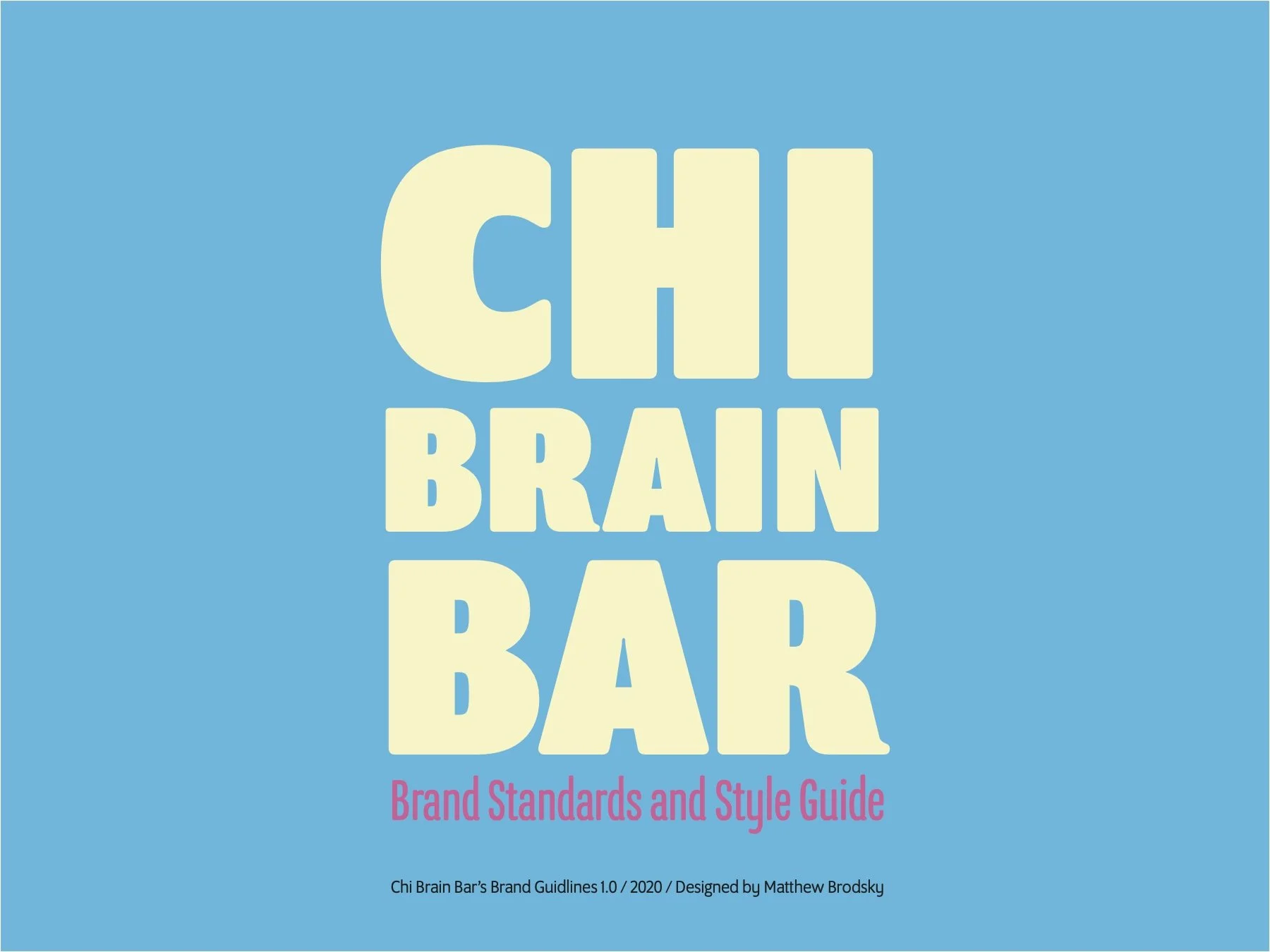
Chi Brain Bar
Mock Non-Profit


-
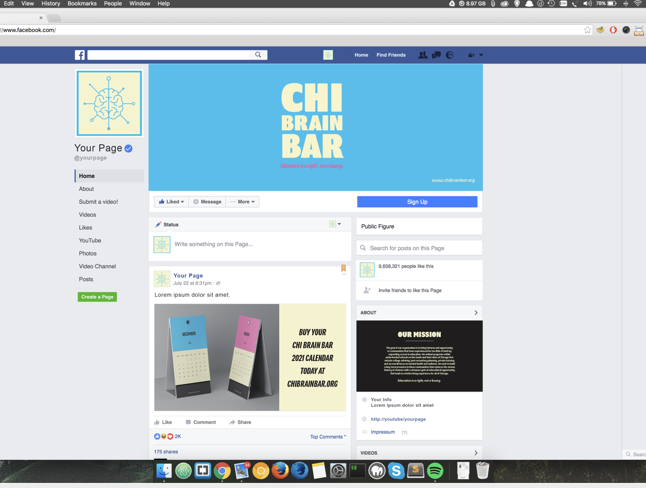
The design fits the product and my demographic target graphic because the typefaces, color combinations, and overall message work to create a cohesive feel that caters to youths and teenagers.
-
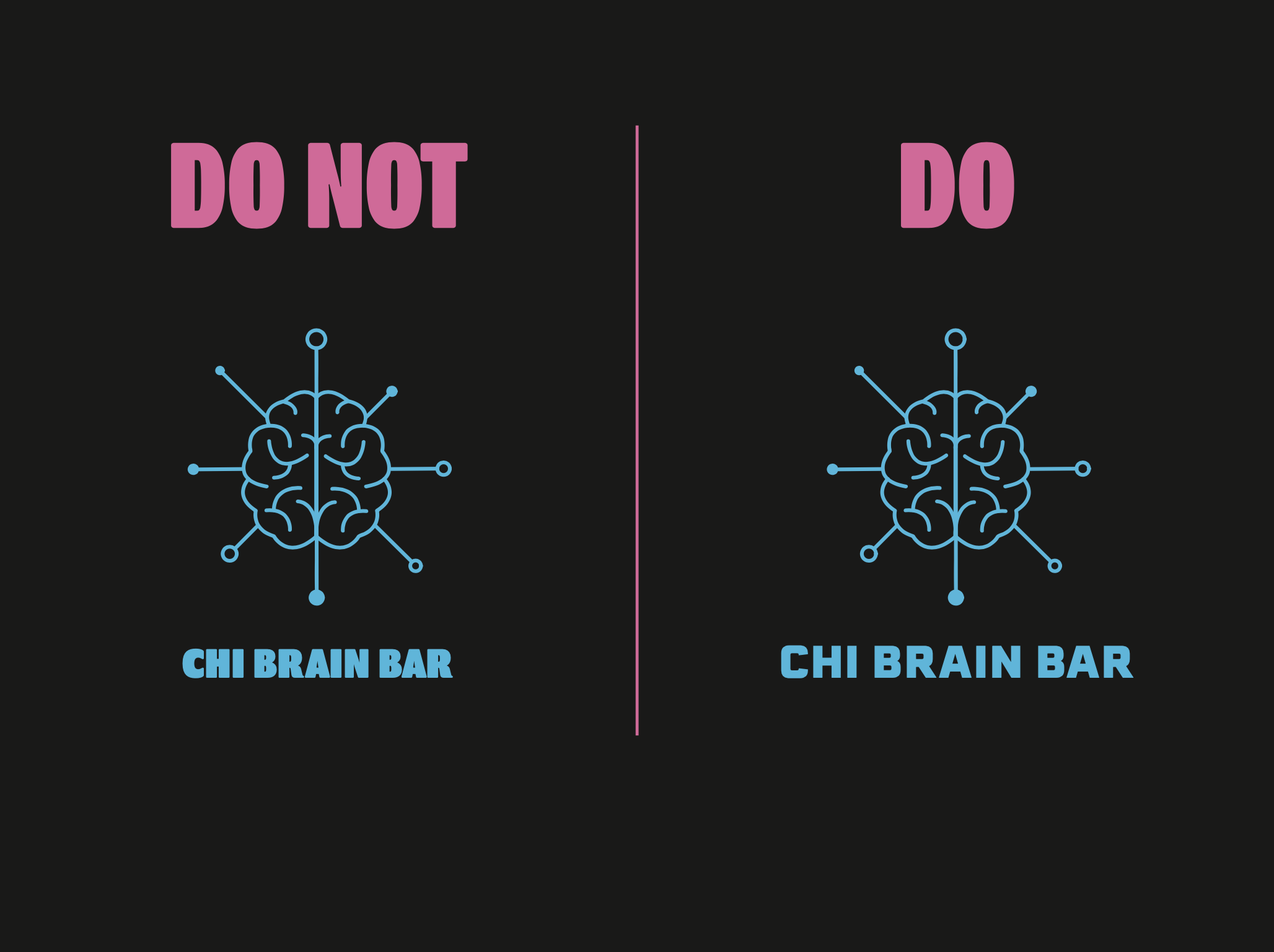
The color usage of my non-profit is as follows: The primary mid-tone is a light blue with hex number 31beef. The highlight color for my brand is a yellowish beige with the hex number f5f3cd. My secondary mid-tone color is bright pink with the hex number eb67a6. Lastly, my shadow color is slightly lighter black with the hex number 201d1f. White may also be used when necessary. I chose these colors to appeal to all genders, young kids, and great potential design opportunities during the branding stages. Combining bright, vibrant colors with clear popping text allows my organization's design to target our chosen demographic and gain interest among them.
-
Regarding the typefaces that I chose for my non-profit organization's brand, I used one entire font family and one other typeface for my logo and type lockup. I mainly used different fonts within the typeface family called Oswald. I also used the typeface program for more minor texts that sit near specific infographics. The typeface next to the Chi Brain Bar logo is called Play Regular; I used his typeface to match the typeface used in my style guide for the same purpose.